Visual Collaboration and Brainstorming Tools for Student Teams
From the Series: Online Tools for Hybrid and Remote Teaching
From the Series: Online Tools for Hybrid and Remote Teaching

Group brainstorms and projects can be a great way to get students to work collaboratively on course topics, engage in more open-ended discussions, and develop and demonstrate their understanding of material better than through individualized research papers or traditional class discussion boards. When we are teaching courses either completely online or through a hybrid of physical classroom and online instruction, we may encounter barriers to creating spaces for students to engage interactively with each other. However, this post offers resources that instructors can use to add elements of active and collaborative learning that go beyond text-based discussion boards and video seminars. These platforms range from spaces for synchronous brainstorming to platforms that can be accessed at any time by students and instructors to add content as their schedules allow.
We start our discussion with Zoom Whiteboard, representing the most limited of the brainstorming and collaborative tools in this set—but also the most accessible if Zoom is already being used in your university’s online classrooms. We then introduce some external tools with more extensive features that enable both synchronous and asynchronous collaboration. Using these tools can create more engaging discussions, incorporate visual media, and provide participation opportunities to students less comfortable or less able to contribute to online synchronous discussions. This post will discuss the following platforms: Zoom Whiteboard, Mural, Padlet, and (briefly) Google Jamboard.
During these times when we are primarily working online, many of us have become well-versed in Zoom video calling. Zoom Whiteboard is a function within the Zoom session that allows synchronous visual interactions during a Zoom call. As long as you have a Zoom account and have enabled this whiteboard function in your settings, you will have access. This function is great for instructors who use chalkboards or whiteboards in their classrooms for large or small group brainstorming. Depending on your comfort level, the size of your groups, and your purposes in using the Zoom Whiteboard, you can allow all students to annotate onto the whiteboard or you can allow only yourself, as the instructor and host of the meeting, to do annotations.
To access the Zoom Whiteboard, you can click Share screen on the bottom menu. From the menu that opens, you can either select a blank whiteboard or a document or image you already have open on your desktop, and the chosen element will appear for everyone to see. By selecting the Annotate option, students and instructors can write, draw, or comment on the shared screen or whiteboard. Another option is to plug in a tablet or other external device that you can use with a stylus for easier writing; this option also appears after you click Share screen.
Zoom Whiteboard has several limitations:
Mural provides a digital workspace for group brainstorming and collaborative creation through the use of templates or blank whiteboard spaces. When navigating to the website, you can sign up for a free trial, and this free trial can be linked to a free education account if you are affiliated with an institution (as a student or an instructor). When signing up, you need to name your workspace, and this could be a class name or a project name. At this point, you can start inviting collaborators on different mural projects.
Within each board, you are free to add sticky notes, text boxes, images, shapes, connectors, as well as link any of these with outside URLs or files that you want to upload to the brainstorming board. There are many shapes, symbols, and connectors to choose from, and assigning people different colors could be a way of seeing who suggests what idea or contributes a specific part of the project. There is an associated chat box on each project where people can speak with each other when they are working at the same time on the project; alternatively, the chat can be used as a record of thoughts and ideas about how to move forward. People can also comment on individual pieces in the workspace if they have questions or want to draw attention to specific details.
When you add details to the workspace, you need to think about the size and organization of information because Mural allows you to create elements of many different sizes and utilize zoom in and zoom out functions. This allows you to make major ideas larger in the workspace and make facets of those major ideas smaller and more visible when someone zooms in to the workspace (see the screenshots below).
Additionally, the platform supports timed brainstorming and voting. There is a built-in timer in the top center that can be used to give yourself or your students a timed session for work. The voting option gives participants in the workspace the opportunity to vote on what elements of the project they find most interesting or to say which elements they want to work on for the project. You can ask whatever question you want from within the voting platform, but it has to be a question that can be answered by other participants clicking on elements already within the workspace. For instance, after five minutes of brainstorming individually on the workspace, a voting element could provide a democratic way to choose what brainstormed elements match with the overall project the students want to pursue.
Mural limitations:
Padlet is a platform for creating collaborative virtual bulletin boards. Padlet is easy to access and fairly simple to use. As a teacher, if you create a Padlet and allow users with the link to contribute (you must enable Visitors can write in the sharing settings menu), your students can add posts to a board without creating their own account. The free account version of the platform allows users to create and work on three boards simultaneously, so with this account option, you can coordinate different Padlets for three different courses. However, you are limited to these three Padlets, so you will have to recycle Padlets if you need more than three for the term. You can download or export PDF files of your Padlets, and then clear them for reuse with a different topic.
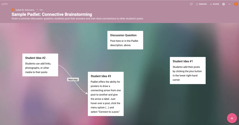
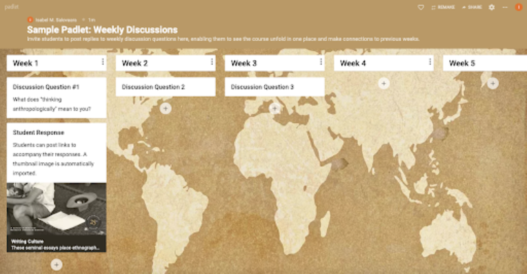
Students can add links, text, and images to a relatively clean and orderly interface with a selection of colorful and themed backgrounds. Depending on the requirements of your course or brainstorming activity, you can choose from many different options of Padlets, including walls, shelves, or grids (where posts are organized in grid fashion with some slight nuances in each style); canvases (where posts can be placed in whatever order and linked together through more free-form creation); streams or backchannels (where the information flows as you scroll up and down the page); timelines (where information is organized through a series of nodes organized from left to right); or maps (where information and posts are overlaid on specific locations on the world map). Padlet can be used as an alternative or supplement to the discussion board feature built into many learning management systems (LMS) and offers you the option of having students’ names shown when they create notes or comments on the Padlet, allowing you to see what students are interacting with which materials or questions.
Padlet limitations:
For examples of Padlets, check out this gallery (a Padlet of links to other Padlets), and the examples featured below.


Google Jamboard is part of the Google Suite of options for classroom engagement, which can be convenient if your institution is already running on Gmail services. If you navigate to jamboard.google.com, you can sign in with your institution credentials, similar to accessing other services from the GSuite. Jamboard offers functionalities similar to Padlet but more limited than Mural, with an emphasis on sticky notes and whiteboard functionalities (writing and erasing). Jamboards, once created, can be shared with an unlimited number of participants and can be accessed on phones, tablets, or computers as long as a participant can log in to their Google account.
Visual brainstorming and collaboration tools available in the digital realm are certainly not limited to those featured in this post, but these represent a small collection of platforms used and suggested by contributors to Fieldsights. These online, synchronous and asynchronous tools will provide elegant spaces of collaboration as we navigate our paths through online and hybrid classroom platforms.